
How to make a professional website design!
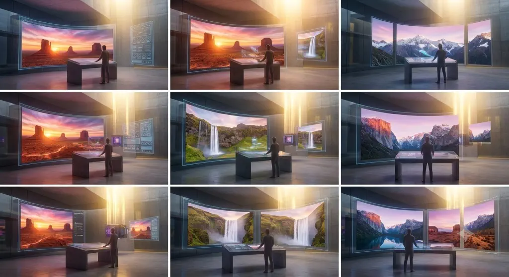
Step by step Here’s a simple roadmap every new designer can follow to make a website that actually impresses people, not just look “nice.” 1. Start with the goal, not the colors Before opening Figma or picking fonts, ask: Examples: If the purpose is unclear, even a beautiful design can feel messy. 2. Study 5–10 great websites Don’t copy blindly. Analyze. Look at: Examples of sites beginners often learn from: Ask yourself: 3. Focus on structure before visual style A strong website starts with a good layout. Plan the page in this order: Example homepage structure for a freelance designer: If the structure is weak, adding fancy effects won’t save it. Harsh but useful. 4. Make the first screen powerful The hero section is the first impression. A strong hero usually includes: Bad example: Better example: That tells people what you do and why it matters. 5. Use fewer fonts, colors, and styles Beginners often try to impress by adding too much. Real impressive design usually feels controlled. Good starting rule: Example: A limited system makes your work look more professional immediately. 6. Master spacing and alignment This is one of the biggest differences between beginner and polished design. Check: Example:A simple design with perfect spacing often looks better than a flashy design with cluttered alignment. If something feels “off,” it’s often spacing, not color. 7. Build strong visual hierarchy People don’t read websites in order. They scan. Use hierarchy through: Example:For a SaaS landing page: This makes the path obvious. 8. Write clear copy Design alone doesn’t impress if the words are vague. Avoid: Use: Clear copy makes average design look better. Confusing copy makes great design feel weaker. 9. Use high-quality images or mockups Bad visuals ruin good layouts. Use: Examples: Avoid random stock images that feel generic and soulless. Your website deserves better than “person pointing at laptop.” 10. Design mobile first, or at least mobile early A website that looks great on desktop but breaks on phone is not impressive. Check: Example:A 3-column feature section on desktop might become a clean vertical stack on mobile. Responsive design is not a bonus. It’s part of the job. 11. Add subtle interaction, not chaos Animation can make a website feel polished, but too much makes it feel amateur. Good examples: Bad examples: Think “smooth and intentional,” not “look, I found effects.” 12. Show trust immediately Impressive websites feel credible. Ways to build trust: Example:Instead of just saying “I’m a great designer,” show: Proof beats claims every time. 13. Make navigation effortless If people get confused, they leave. Keep navigation: Good nav example: Bad nav example: Creative naming is fun until no one knows where to click. 14. Polish the details The details are where “good” becomes “impressive.” Check: Example:A contact form with clean labels, spacing, and a friendly success message feels far more premium than a plain default form. 15. Test with real people Even one or two people can reveal major issues. Ask them: If they hesitate, the design needs clarity. What impressive beginner websites usually have Even simple websites can impress if they include: That’s the formula. 3 example website concepts Example 1: Personal portfolio Goal: Get freelance clients Structure: What makes it impressive: Example 2: Coffee shop website Goal: Get visits and online orders Structure: What makes it impressive: Example 3: Startup landing page Goal: Get signups Structure: Headline example: What makes it impressive: A beginner-friendly checklist Before you call a design finished, ask: If yes to most of these, you’re already doing better than many beginners. Best mindset for new designers Don’t try to make the website impressive by making it complicated. Make it: That’s what actually impresses people. If you want, I can also give you:
Getting Started With Building Your Online Landscape Photography Portfolio
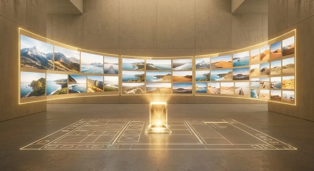
Turn your passion for landscape photography into a stunning online portfolio Getting started with your online landscape photography portfolio can feel daunting. This guide will walk you through four key stages, visualized as distinct environments that represent your journey from initial organization to a shining, professional showcase. Phase 1: Preparation, Culling, and OrganizationBefore you look at a single website template, you must master your catalog. The foundation of a great portfolio isn’t all your photos; it’s your best photos, curated relentlessly. The Strategy: Gather: Collect your strongest work from the past few years. Cull Ruthlessly: This is the hardest part. Be critical. Group similar shots (e.g., three sunset ocean photos) and select only the absolute strongest one. Your portfolio is defined by its weakest image. Organize: Structure your selected images into logical folders or collections (e.g., Mountains, Coastlines, Desert, Night Skies). Visualization: The Digital Workshop Your journey begins in an environment of organized structure. Image 1 shows a modern, minimalist studio bathed in cool, ambient blue light. This isn’t a darkroom; it’s a digital workshop. Instead of chemical trays, illuminated glass panels float in the air. These panels display organized, categorized thumbnail grids. Your work is separated into distinct, coherent stacks, ready to be refined. Phase 2: Selecting Your Platform and Defining the VisionWith your images organized (Image 1), you need to choose where they will live. While social media is good for reach, a dedicated website is essential for professionalism. The Strategy: Platform Choice: Popular website builders for photographers include Squarespace, Wix, Format, or Zenfolio. If you want maximum control, WordPress (with a theme like Flothemes or ProPhoto) is powerful but complex. Analyze Templates: Look for themes designed specifically for photography. They must be clean, minimalist, and, above all, responsive (meaning they adapt perfectly to mobile devices and desktops). Define the Structure: Your site only needs a few core pages: Home: A stunning, high-impact image or slideshow. Galleries: The organized collections from Phase 1. About: A brief bio and your artist statement. Contact: A simple form. Visualization: Projecting the Structure We move into a visualization of structure. Taking the cool ambient light and minimalist design aesthetic from the studio (Image 1), Image 2 shows a larger, slightly industrial space. A complex, glowing grid or blueprint is projected across the concrete floor and walls. A translucent avatar of a person is interacting with floating interface panels, actively selecting and designing how the landscape galleries will flow. Phase 3: Optimizing for the Web (Squashing the Tech Hurdles)You have your curated images (Phase 1) and your platform defined (Phase 2), but if you upload the full-resolution files, your website will be painfully slow. Poor performance will kill user experience and ruin your search engine optimization (SEO). The Strategy: Resize Images for the Web: Don’t just upload the original file. A standard width of 2000 pixels on the long edge is usually sufficient for large displays. Compress: Use tools (like Lightroom’s export settings, Photoshop, or plugins like TinyJPG) to compress your JPEGs. Your goal is to find the balance where the image looks great but the file size is drastically reduced (often under 500 KB per image). SEO Basics: Alt Text: This is crucial. For every image, write a specific description (e.g., Alt Text: Sunrise over the jagged peaks of the Patagonia mountains, reflections in a still lake). This helps search engines understand your content. Filename: Use keywords. Rename _DSC1234.jpg to patagonia-mountain-sunrise.jpg. Visualization: The Compression Chamber This visualization shows the critical technical process. The scene is a stylized digital “compression chamber.” Expanding on the aesthetic from Image 2, Image 3 features a complex network of light beams funneling the large, data-heavy landscape visualizations from previous images. As the images pass through a series of glowing blue geometric “reduction grids” (modeled on the blueprint from Image 2), they exit smaller and more refined, but still retain their radiant internal energy. This is the definition of data-efficient optimization. Phase 4: Launch and Final Review (Finding the Flow)You have structured, designed, and optimized. Now you are ready to assemble and launch. The Strategy: Assemble the Pages: Upload your optimized images and build the simple menu structure you defined in Phase 2. Test and Review: Before announcing your site to the world, review it: Check every link: Do they all work? Test on mobile: Does the site flow perfectly on your phone? Is the text readable? Proofread: Are there typos? The Final Culling (Optional but Recommended): Now that you see everything assembled, does it flow perfectly? If one image still feels like a outlier, be bold and remove it. Visualization: The Radiant Showcase Image 4 brings us into the same polished architectural space, but the cool blue ambient environment (from Images 1, 2, and 3) has been overcome. The space is now flooded with warm, radiant golden light, generated by the optimized and active portfolio. A series of large, interconnected display screens showcase the landscape photos in perfect harmony. The central crystalline core, which was just beginning to activate with refined data in Image 3, is now fully illuminated and shining as the heart of a perfect, finalized digital portfolio.
How to Overcome Mental Blockage and Unlock Fresh Ideas:
A Practical Guide Breaking Free: Why Your Brain Gets Stuck (And How to Jumpstart It)Every creative mind hits a wall. Whether you’re staring at a blank canvas, struggling to write the first sentence, or searching for that breakthrough concept—mental blockage is frustratingly universal. The good news? It’s not a permanent condition. It’s a signal, not a sentence.In this guide, we’ll explore proven strategies to overcome mental blocks and free your brain to generate bold, innovative ideas. Plus, we’ll show you how visual tools—like photos—can become your secret weapon for creative breakthroughs. Understanding Mental BlockageMental blocks happen when your brain hits a cognitive bottleneck. Stress, fatigue, perfectionism, or simply overworking one neural pathway can silence your creativity. The result? Stagnation.But here’s thePerspective shift: Blockage is your brain asking for a different approach. Proven Strategies to Overcome Blockage and Spark New Ideas Putting It All Together: Your Creative Unlock ToolkitStrategy When to Use It Quick ActionEnvironment Change Feeling stuck in routine Walk to a new café or rearrange your deskVisual Prompts Need inspiration Browse 10 unrelated photos; note what resonatesImpose Constraints Overwhelmed by options Limit yourself to 3 concepts or 500 wordsImperfect Action Paralyzed by perfectionism Create a “bad first draft” in 15 minutesRest & Subconscious Exhausted or frustrated Take a walk; let ideas surface naturally Your Brain Is Waiting to Create—Will You Let It?You have more creative potential than you realize. Mental blockage isn’t a wall—it’s a detour sign. Your brain wants to generate ideas; it just needs the right conditions.So next time you’re stuck, remember: change your view, use what you see, set limits, act anyway, and rest.The next breakthrough idea? It’s already forming. You just need to give your brain permission to find it. What strategy will you try first? Share your thoughts in the comments below—we’d love to hear how you’re unlocking your creativity.
The Visibility Crisis: Why Your Talent Is Going Unseen And How to Change That

In an age of digital oversaturation, standing out isn’t just about skill—it’s about strategy. Here’s how to reignite your passion and get the world to notice your work. Remember when a single great photo could define a career? Today, the landscape has shifted dramatically. You are incredibly talented. Your portfolio is stunning. Yet, the like count is low, the DMs are silent, and that initial spark that drew you to photography feels like it’s flickering out. You aren’t imagining it. The motivation of talented photographers is falling, and the statistics paint a clear picture of why. The Hard Truth: The Numbers Don’t Lie It’s not a lack of skill that is holding you back—it is the sheer volume of noise. The result? A world where incredible talent gets buried instantly, and the only thing separating the seen from the unseen is often just visibility strategy, not photographic ability. Reclaiming Your Spotlight If the stats feel daunting, take a breath. The solution isn’t about working harder or buying better gear; it’s about working smarter and connecting deeper. Your Next Step The decline in motivation is a real phenomenon, but it doesn’t have to be your story. The digital world is crowded, but it is also vast. There is room for your work; you just need the map to find it. Second thought The critical layers you must add to your core skill set to truly stand out in the digital age: 1. Distinctive Authority and Point of View Skill is a commodity; your perspective is rare. There are millions of skilled designers, developers, and writers. Very few have a truly unique point of view (POV). 2. Radical Authenticity and Personal Brand Story In a crowded, algorithmic feed, vulnerability and storytelling create a rare connection that skill cannot. People don’t just buy products or services; they buy people they trust and relate to. 3. Mastering the Art of Content Amplification You might have the skills to build a masterpiece, but in a digital ocean, if you can’t act as your own amplifier, that masterpiece will sink without a trace. 4. Strategic Niches vs. Generalist Talent A highly developed, singular skill is easily overlooked in a general market. To stand out, you must be a generalist no longer. 5. A Deep Focus on Problem-Solving over Portfolio-Building Most digital portfolios show what you can do. A truly standout portfolio shows how you solved a critical business problem. We want to hear from you.Are you feeling the pressure of oversaturation? What is the one thing you feel is holding your portfolio back from the recognition it deserves? Drop your thoughts in the comments below—let’s brainstorm strategies together.
Your First Photography Portfolio
Introduction: Why Every Photographer Needs a Gallery Site You’ve got the camera. You’ve mastered composition, lighting, and editing. Now what? If you’re serious about growing as a photographer—whether you dream of booking clients, selling prints, or simply sharing your vision with the world—you need a home for your work. That’s where a gallery website comes in. Here’s the truth: Your Instagram feed is great for quick likes, but it doesn’t tell the full story of your artistry. A dedicated portfolio site does. It shows professionalism, gives you complete creative control, and converts visitors into fans, clients, or buyers. The best part? You don’t need to be a tech wizard to build one. In this guide, we’ll walk you through every first step to creating a stunning photography gallery site—from choosing the right platform to showcasing your best work. Ready to put your photography career on the map? Let’s dive in. Step 1: Define Your Purpose and Audience Before you start building, ask yourself: What do I want my gallery to achieve? Are you trying to attract wedding clients? Sell landscape prints? Simply share your creative journey? Your answer shapes everything—from the design you choose to the images you feature. Examples of Different Photography Goals: Goal Best Approach Recommended Gallery Style Wedding/Portrait Clients Showcasing full galleries, testimonials, clear pricing Clean, image-heavy, easy navigation Fine Art Print Sales High-resolution images, shopping integration, limited edition badges Minimalist, gallery-focused Editorial/Commercial Diverse portfolio, client logos, “About” feature Bold, magazine-inspired layout Personal/Artistic Storytelling, creative organization, blog integration Experimental, unique design Pro Tip: Choose 2-3 main categories maximum. A cluttered portfolio confuses visitors and dilutes your message. Step 2: Choose the Right Platform Not all website builders are created equal—especially for image-heavy galleries. Here’s what to look for: Popular Platform Options for Photographers: Squarespace — Best for: Beautiful, designer-quality sites with minimal effort Example template: “Paloma” for visual-heavy portfolios, “Masonry” for grid layouts Wix — Best for: Complete beginners wanting drag-and-drop simplicity Example feature: Artificial Design Intelligence (ADI) builds your site in minutes Adobe Portfolio — Best for: Creative Cloud members wanting seamless integration Example benefit: Direct sync with Lightroom and Behance Self-hosted WordPress — Best for: Maximum customization and control Example plugin: NextGEN Gallery or FooGallery for advanced image management Our recommendation: Start with Squarespace or Wix if you’re brand new. You can always migrate later as your needs grow. Step 3: Curate Your Best Work (Less Is More) This is where many new photographers struggle: what do I include? Resist the urge to upload every photo you’ve ever taken. A powerful portfolio is curated, not comprehensive. The 80/20 Rule for Portfolio Selection Choose your top 15-25 images maximum. Ask yourself: Example Portfolio Structure: Landing Page: Your single strongest image as a hero shot Gallery 1: “Selected Works” — Your absolute best 10-15 images Gallery 2: “Weddings” or “Portraits” — Category-specific collections (6-8 images each) Gallery 3: “Behind the Scenes” or “Process” — Personal touch (optional) Step 4: Optimize Your Images for the Web Here’s a technical step many beginners skip—but it makes a massive difference. Large, high-resolution files look stunning but slow down your site. That’s a problem because: Quick Image Optimization Checklist: Pro Tip: Most website builders now offer automatic image optimization. Enable this feature and save yourself hours of manual work. Step 5: Design Your Gallery Layout Now comes the fun part—making your site look like you. Your gallery layout sets the mood and guides how visitors experience your work. Popular Gallery Layouts for Photographers: Masonry/Grid Layout Best for: Mixed aspect ratios, artistic portfolios Example: A Pinterest-style waterfall that accommodates both portrait and landscape shots Horizontal Scroll Best for: Cinematic, storytelling-driven portfolios Example: Interactive experience that mimics walking through a gallery Full-Screen Slideshow Best for: Dramatic, impact-focused photography Example: One image at a time with subtle transitions Lightbox Gallery Best for: Clean, minimal sites Example: Click an image to view it full-screen against a dark or light background Design Principle: Let your images breathe. White space (or negative space) isn’t wasted space—it draws attention to your work. Step 6: Add Essential Pages A complete photography site has more than just a gallery. Include these key pages: Must-Have Pages: 1. Home — Your hook. One stunning image + a clear introduction 2. Portfolio/Gallery — The heart of your site. Organized, easy to navigate 3. About — Your story. Why you photograph, what drives you, and a friendly photo of yourself Example: “Hi, I’m Sarah. I believe every couple has a story worth telling. My approach is documentary-style—capturing real moments without stiff poses.” 4. Services/Pricing — What you offer and how much (if you’re booking clients) Example: “Wedding Collection I — $2,500 8 hours coverage Online gallery with 400+ edited images Print release” 5. Contact — Make it easy to reach you. Email form, social links, or booking integration Step 7: Tell Your Story (The Persuasive Element) Here’s what separates amateur sites from professional ones: personality. Your gallery should invite visitors into your world. Use your “About” page and image descriptions to share your perspective. Examples of Compelling Photographer Bios: Before (Generic): “I’m a photographer based in Chicago. I specialize in weddings and portraits.” After (Persuasive & Personal): “I started photographing weddings because I believe love isn’t about perfect poses—it’s about the laugh your partner cracks when no one’s looking, the tears you try to hide, the hand squeeze that says ‘we’ve got this.’ Based in Chicago, I travel worldwide to capture these moments.” See the difference? The second version sells an experience, not just a service. Step 8: Launch and Promote You’ve built your gallery. Now it’s time to get eyes on it. Actionable Launch Steps: Conclusion: Your Work Deserves a Home Building your first photography gallery website is more than a technical task—it’s a statement. It says, “I’m serious about this. I’m here to stay.” You don’t need a massive budget or coding expertise. You need a clear vision, curated images, and the courage to put yourself out there. Start small. Launch