
Step by step
Here’s a simple roadmap every new designer can follow to make a website that actually impresses people, not just look “nice.”
1. Start with the goal, not the colors
Before opening Figma or picking fonts, ask:
- What is this website supposed to do?
- Who is it for?
- What action should users take?
Examples:
- A portfolio should make it easy to see work and contact you.
- A restaurant site should help people view the menu, location, and book a table.
- A startup landing page should explain the product fast and push signups.
If the purpose is unclear, even a beautiful design can feel messy.
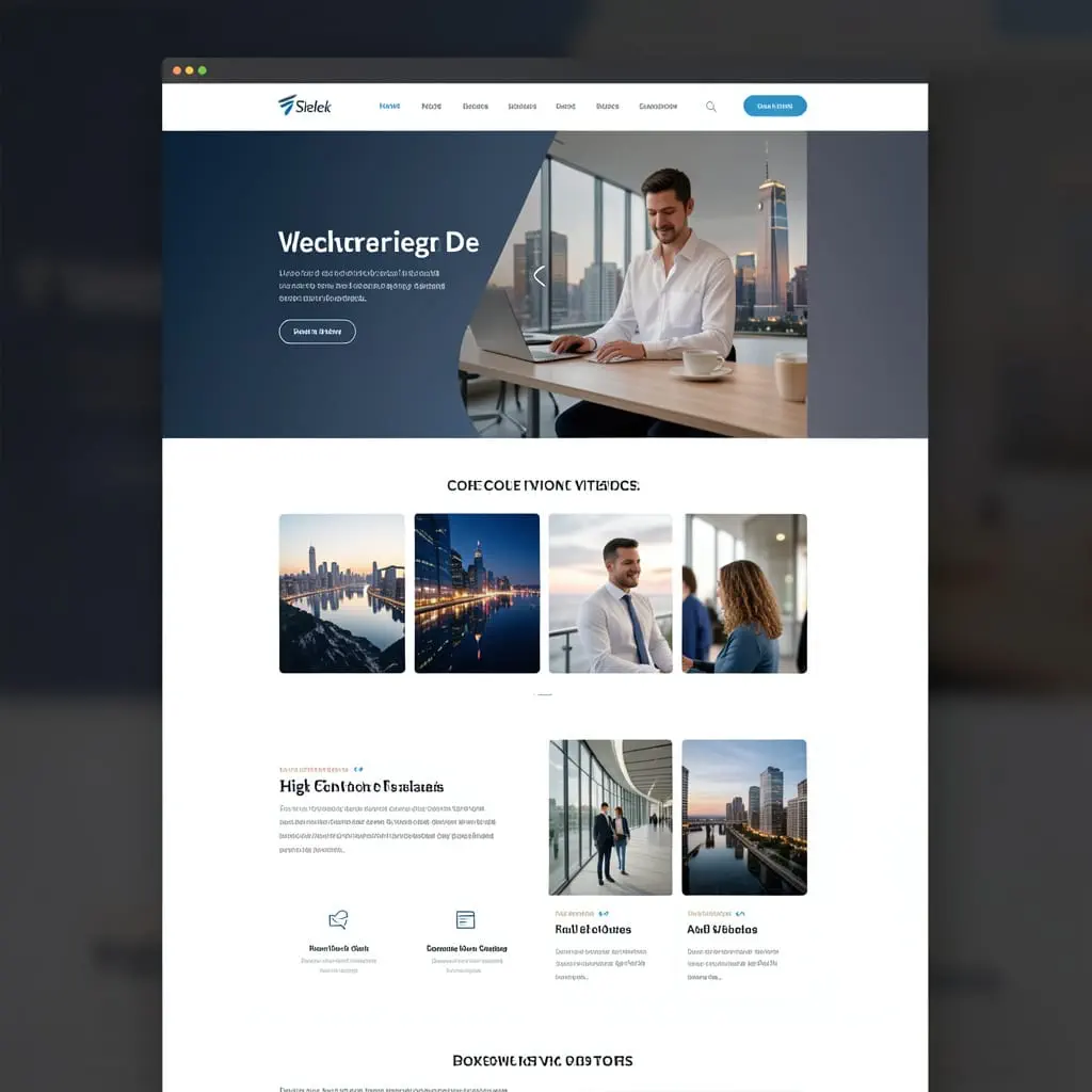
2. Study 5–10 great websites
Don’t copy blindly. Analyze.
Look at:
- Layout
- Spacing
- Navigation
- Typography
- Button styles
- How they guide attention
Examples of sites beginners often learn from:
- Apple — clean hierarchy, strong visuals
- Stripe — excellent layout and product storytelling
- Airbnb — easy navigation and trust-building
- Notion — simple, clear, modern
- Framer templates — useful for current landing page patterns
Ask yourself:
- What grabs attention first?
- Why does it feel premium?
- How do they make content easy to scan?
3. Focus on structure before visual style
A strong website starts with a good layout.
Plan the page in this order:
- Header
- Hero section
- Features/services
- Social proof
- About
- Call to action
- Footer
Example homepage structure for a freelance designer:
- Big headline: “I design brands and websites that people remember.”
- Short supporting text
- CTA button: “View Projects”
- Selected work grid
- Client testimonials
- About section
- Contact CTA
If the structure is weak, adding fancy effects won’t save it. Harsh but useful.
4. Make the first screen powerful
The hero section is the first impression.
A strong hero usually includes:
- Clear headline
- Short subheadline
- One main call-to-action
- Strong visual or product image
Bad example:
- “Welcome to my website”
Better example:
- “Custom websites for small businesses that want to look premium and convert more customers.”
That tells people what you do and why it matters.
5. Use fewer fonts, colors, and styles
Beginners often try to impress by adding too much. Real impressive design usually feels controlled.
Good starting rule:
- 1–2 fonts
- 1 primary color
- 1 accent color
- Consistent button style
- Consistent spacing system
Example:
- Font pair: Inter + Playfair Display
- Colors: white, dark charcoal, deep blue accent
- Buttons: rounded, one primary style only
A limited system makes your work look more professional immediately.
6. Master spacing and alignment
This is one of the biggest differences between beginner and polished design.
Check:
- Are sections evenly spaced?
- Are text blocks aligned?
- Is there enough breathing room?
- Are margins consistent?
Example:
A simple design with perfect spacing often looks better than a flashy design with cluttered alignment.
If something feels “off,” it’s often spacing, not color.
7. Build strong visual hierarchy
People don’t read websites in order. They scan.
Use hierarchy through:
- Larger headlines
- Smaller supporting text
- Contrasting buttons
- White space
- Section separation
Example:
For a SaaS landing page:
- Big headline
- Short explanatory line
- Bright signup button
- Product screenshot beneath
This makes the path obvious.
8. Write clear copy
Design alone doesn’t impress if the words are vague.
Avoid:
- “We provide innovative solutions for your business needs.”
Use:
- “We build fast, modern websites that help local businesses get more leads.”
Clear copy makes average design look better. Confusing copy makes great design feel weaker.
9. Use high-quality images or mockups
Bad visuals ruin good layouts.
Use:
- Crisp photography
- Consistent illustration style
- Realistic mockups
- Clean icons
Examples:
- A fashion site should use bold editorial photography.
- A tech startup site might use clean UI mockups.
- A personal portfolio can use project thumbnails with consistent styling.
Avoid random stock images that feel generic and soulless. Your website deserves better than “person pointing at laptop.”
10. Design mobile first, or at least mobile early
A website that looks great on desktop but breaks on phone is not impressive.
Check:
- Is text still readable?
- Do buttons stay easy to tap?
- Does the layout stack well?
- Is the navigation simple?
Example:
A 3-column feature section on desktop might become a clean vertical stack on mobile.
Responsive design is not a bonus. It’s part of the job.

11. Add subtle interaction, not chaos
Animation can make a website feel polished, but too much makes it feel amateur.
Good examples:
- Buttons with slight hover changes
- Smooth scrolling
- Fade-in on sections
- Card hover elevation
- Micro-interactions on forms
Bad examples:
- Everything bouncing
- Auto-playing popups
- Too many parallax effects
- Flashy transitions on every scroll
Think “smooth and intentional,” not “look, I found effects.”
12. Show trust immediately
Impressive websites feel credible.
Ways to build trust:
- Testimonials
- Client logos
- Ratings
- Case studies
- Clear contact info
- Professional About section
Example:
Instead of just saying “I’m a great designer,” show:
- 3 real projects
- 2 testimonials
- A short process section
- A clear contact method
Proof beats claims every time.
13. Make navigation effortless
If people get confused, they leave.
Keep navigation:
- Simple
- Short
- Predictable
Good nav example:
- Home
- Work
- Services
- About
- Contact
Bad nav example:
- Welcome
- Journey
- Vision
- Experience
- Connect Universe
Creative naming is fun until no one knows where to click.
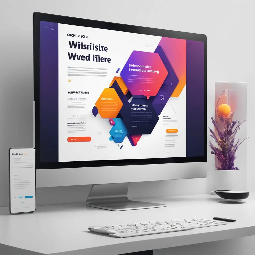
14. Polish the details
The details are where “good” becomes “impressive.”
Check:
- Button states
- Hover states
- Form design
- Icon consistency
- Footer layout
- Empty states
- Error messages
- Section transitions
Example:
A contact form with clean labels, spacing, and a friendly success message feels far more premium than a plain default form.
15. Test with real people
Even one or two people can reveal major issues.
Ask them:
- What is this website about?
- What should you click first?
- What feels confusing?
- Does it feel trustworthy?
If they hesitate, the design needs clarity.
What impressive beginner websites usually have
Even simple websites can impress if they include:
- One strong idea
- Clean layout
- Consistent typography
- Great spacing
- Clear CTA
- Quality visuals
- Fast understanding
- Mobile friendliness
That’s the formula.
3 example website concepts
Example 1: Personal portfolio
Goal: Get freelance clients
Structure:
- Hero: “I design clean websites for modern brands.”
- CTA: “See My Work”
- 3 featured projects
- Short about section
- Testimonials
- Contact form
What makes it impressive:
- Strong typography
- Big project visuals
- Minimal color palette
- Clear personal brand
Example 2: Coffee shop website
Goal: Get visits and online orders
Structure:
- Hero image of drinks/interior
- Headline: “Craft coffee, baked fresh daily.”
- Buttons: “View Menu” and “Visit Us”
- Bestsellers section
- Store hours and map
- Customer reviews
What makes it impressive:
- Warm photography
- Easy-to-find info
- Strong local personality
- Fast mobile access
Example 3: Startup landing page
Goal: Get signups
Structure:
- Hero with product value
- App screenshot
- Features in 3 cards
- Testimonials/logos
- Pricing
- Final CTA
Headline example:
- “Plan your team’s work in half the time.”
What makes it impressive:
- Clear benefit
- Product visuals
- Strong hierarchy
- Focused signup flow
A beginner-friendly checklist
Before you call a design finished, ask:
- Is the purpose clear in 5 seconds?
- Is the layout easy to scan?
- Are fonts and colors consistent?
- Is there enough white space?
- Is the CTA obvious?
- Does it work on mobile?
- Do the images feel high quality?
- Does it look trustworthy?
- Is anything unnecessary?
If yes to most of these, you’re already doing better than many beginners.
Best mindset for new designers
Don’t try to make the website impressive by making it complicated.
Make it:
- Clear
- useful
- elegant
- consistent
That’s what actually impresses people.
If you want, I can also give you:
- a step-by-step beginner process from idea to finished homepage, or
- 5 real homepage examples broken down section by section.