
Turn your passion for landscape photography into a stunning online portfolio
Getting started with your online landscape photography portfolio can feel daunting. This guide will walk you through four key stages, visualized as distinct environments that represent your journey from initial organization to a shining, professional showcase.
Phase 1: Preparation, Culling, and Organization
Before you look at a single website template, you must master your catalog. The foundation of a great portfolio isn’t all your photos; it’s your best photos, curated relentlessly.
The Strategy:
Gather: Collect your strongest work from the past few years.
Cull Ruthlessly: This is the hardest part. Be critical. Group similar shots (e.g., three sunset ocean photos) and select only the absolute strongest one. Your portfolio is defined by its weakest image.
Organize: Structure your selected images into logical folders or collections (e.g., Mountains, Coastlines, Desert, Night Skies).
Visualization: The Digital Workshop
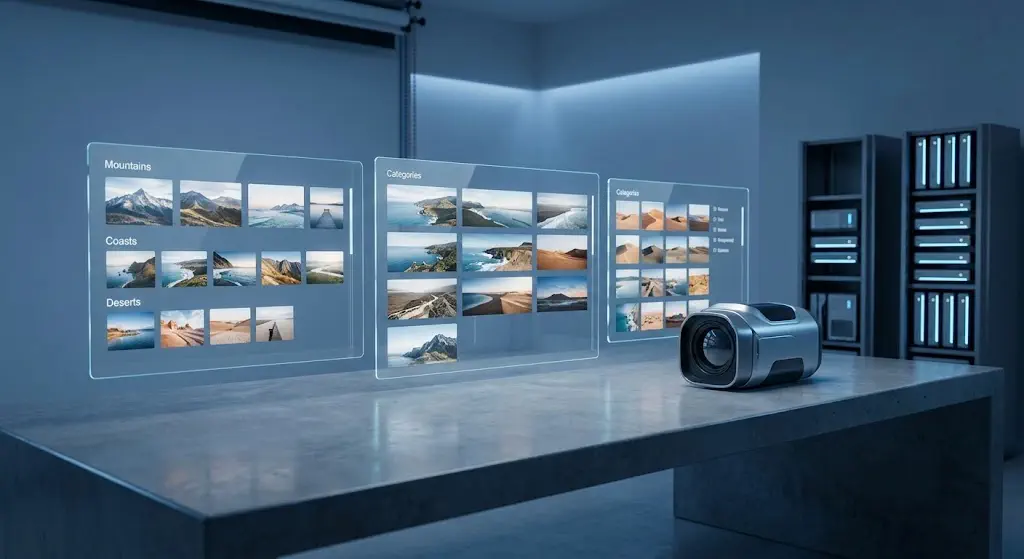
Your journey begins in an environment of organized structure. Image 1 shows a modern, minimalist studio bathed in cool, ambient blue light. This isn’t a darkroom; it’s a digital workshop. Instead of chemical trays, illuminated glass panels float in the air. These panels display organized, categorized thumbnail grids. Your work is separated into distinct, coherent stacks, ready to be refined.
Phase 2: Selecting Your Platform and Defining the Vision
With your images organized (Image 1), you need to choose where they will live. While social media is good for reach, a dedicated website is essential for professionalism.
The Strategy:
Platform Choice: Popular website builders for photographers include Squarespace, Wix, Format, or Zenfolio. If you want maximum control, WordPress (with a theme like Flothemes or ProPhoto) is powerful but complex.
Analyze Templates: Look for themes designed specifically for photography. They must be clean, minimalist, and, above all, responsive (meaning they adapt perfectly to mobile devices and desktops).
Define the Structure: Your site only needs a few core pages:
Home: A stunning, high-impact image or slideshow.
Galleries: The organized collections from Phase 1.
About: A brief bio and your artist statement.
Contact: A simple form.
Visualization: Projecting the Structure
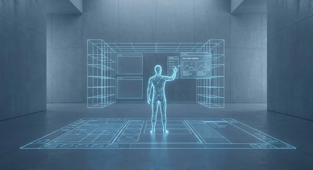
We move into a visualization of structure. Taking the cool ambient light and minimalist design aesthetic from the studio (Image 1), Image 2 shows a larger, slightly industrial space. A complex, glowing grid or blueprint is projected across the concrete floor and walls. A translucent avatar of a person is interacting with floating interface panels, actively selecting and designing how the landscape galleries will flow.
Phase 3: Optimizing for the Web (Squashing the Tech Hurdles)
You have your curated images (Phase 1) and your platform defined (Phase 2), but if you upload the full-resolution files, your website will be painfully slow. Poor performance will kill user experience and ruin your search engine optimization (SEO).
The Strategy:
Resize Images for the Web: Don’t just upload the original file. A standard width of 2000 pixels on the long edge is usually sufficient for large displays.
Compress: Use tools (like Lightroom’s export settings, Photoshop, or plugins like TinyJPG) to compress your JPEGs. Your goal is to find the balance where the image looks great but the file size is drastically reduced (often under 500 KB per image).
SEO Basics:
Alt Text: This is crucial. For every image, write a specific description (e.g., Alt Text: Sunrise over the jagged peaks of the Patagonia mountains, reflections in a still lake). This helps search engines understand your content.
Filename: Use keywords. Rename _DSC1234.jpg to patagonia-mountain-sunrise.jpg.
Visualization: The Compression Chamber
This visualization shows the critical technical process. The scene is a stylized digital “compression chamber.” Expanding on the aesthetic from Image 2, Image 3 features a complex network of light beams funneling the large, data-heavy landscape visualizations from previous images. As the images pass through a series of glowing blue geometric “reduction grids” (modeled on the blueprint from Image 2), they exit smaller and more refined, but still retain their radiant internal energy. This is the definition of data-efficient optimization.
Phase 4: Launch and Final Review (Finding the Flow)
You have structured, designed, and optimized. Now you are ready to assemble and launch.
The Strategy:
Assemble the Pages: Upload your optimized images and build the simple menu structure you defined in Phase 2.
Test and Review: Before announcing your site to the world, review it:
Check every link: Do they all work?

Test on mobile: Does the site flow perfectly on your phone? Is the text readable?
Proofread: Are there typos?
The Final Culling (Optional but Recommended): Now that you see everything assembled, does it flow perfectly? If one image still feels like a outlier, be bold and remove it.
Visualization: The Radiant Showcase
Image 4 brings us into the same polished architectural space, but the cool blue ambient environment (from Images 1, 2, and 3) has been overcome. The space is now flooded with warm, radiant golden light, generated by the optimized and active portfolio. A series of large, interconnected display screens showcase the landscape photos in perfect harmony. The central crystalline core, which was just beginning to activate with refined data in Image 3, is now fully illuminated and shining as the heart of a perfect, finalized digital portfolio.